Create and Delete Forms in EnCaps
Every EnCap needs an actionable form. It lets your customers to share information with you or contact you directly through the loaded buttons embedded within it. Twixor EnCaps comes with built-in controls to create a form with all the required fields.
Let us help you discover how painless it is to create dynamic forms with Twixor EnCaps using these steps.
Navigation: EnCaps-> Workspace -> Select the EnCaps Name
This will open the Launch History page of the selected EnCaps.
1. Click Forms tab. It displays the list of forms created under the selected EnCaps. You can also cancel the form by clicking  option available next to the form name.
2. Click Create New Form to create new forms for the selected EnCap.
3. In Create Form page, type the form name and description of the form respectively in Name and Description. Let us create forms for the EnCap "Book Store". It's important to create a landing or welcome page for discussing the single focused objective of the campaigns.
By way of example, a welcome page called "Welcome to the Book Store" is created for the "Book Store" EnCap.
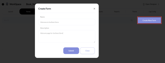
4. Click Submit to create a new form. You should view a created form in the list of forms if the form is created successfully.
5. Subsequently, design the form with text, selection, typed, date/time, and other controls like Section, Hidden, File Upload and Rich text controls provided in the palette by dragging and dropping them in the work area.
Text Controls
Customers interact with EnCap forms through different types of controls. Text controls here can be used to create text fields like Text, Text Area, and Email.
Text
Field for obtaining plain text input Text Area
Multi-line input field Field for obtaining ID of your mail account.
Warning! If an incorrect Email Id is provided by the user, an error message "Invalid email address" will be displayed
Selection Controls
Using these controls, you can allow the users to complete tasks that involves making choices from a set of statements.
Check box
Tick box field to modify a background or to reply Select box
Control to enable the selection in drop down list Radio box
Field to prompt the user to select a single option which is similar to Check box control Img Choice
Control for letting the users to select an image Rating
Field to employ user assessment by means of ratings in numbers Seekbar
Drag-gable thumb control Multiple Choice
Control that allows the user to give multiple inputs Checkbox Grid
Grid to group a series of Checkbox questions (Rows) and options (Columns) Radio Grid
Control for grouping a series of questions and options in radio buttons
Typed Controls
If you want to get numerical input from the user, then use the typed controls. If you provide input other than numbers in Value property, it will be marked in yellow color.
Number
Control to get numerical value Use this control to obtain the Mobile Number from the user
An error message "Invalid mobile number" will be displayed if a user attempts to give an illegitimate phone number
Date/Time Controls
For receiving date/timestamp input from the users, you can use this control.
Date
To get input in Day-Month-Year format Date Time
Place this control to get both date and time Other Controls
You can also include other controls like Section, Hidden Control, and File Upload.
Section
To include different sections in a form File Upload
Files can be uploaded by using this control. Once the user specifies the “Accepted File Type" in the right side panel and upload file search is restricted to such custom files only. Used to save the database data that must be updated when an EnCap form is submitted.
Info! This control cannot be seen or altered by the user
Rich Text Field for obtaining rich text input You have to set the form and field properties for every control you create.
In the properties window, click either Form or Field to edit or view the attributes associated with the selected control.
Configure Form Properties
1. Click Form to view the properties of Form. Figure shown below is the properties configured for the Form "Welcome to the Book Store".
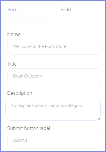
2. Form Name and Description provided while creating form will be displayed in Name and Description . Give the title for the form in Title.
Info! You can also change the Name, Description, and Title for the form anytime
1. Click Field to view the attributes of all fields.
2. Click the respective field to view or edit its properties.
 Email
EmailFields incorporated in all the form controls share the common dimensions cataloged below.
Field Name Description Label Display name for the controls Name Unique name given to all the controls Type Field type and this cannot be changed since it is automatically selected when you choose any field Hint Intimation about the field Value Enter the value for the controls, which if provided, will be submitted through the form.
Label Alignment Alignment of the field label. Select any position from the list - Inherit, Top, Left, Right to place the label in the selected alignment Disable If you choose this option, the field will be disabled and you won't to able to add value to it Validation Required Enable this option to mark the field as mandatory
Info! If you select this option,
mandatory symbol will be displayed right after the label of the chosen field in the launched EnCap. And, if the input is not given by the EnCap user for this particular field, the warning message "Required" will be showed.
Some fields has unique properties associated with the selected control. These properties are listed here:
Example:
Let us create forms for the EnCap Book Store using the controls provided in the palette. For example, the Registration Form for registering the new customers can be created with the text and typed controls as shown below:

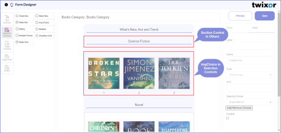
Another form called Books Category can also be created to allow the users to browse the books by genre. Below shown is the Books Category form created by dragging and dropping the Section and Selection controls.
Set Values in Form Fields
You can easily reuse the form fields value from one form to another form by giving the name of the data key within double curly brackets {{Data key name}}. For an instance let's take the form called Payment Mode from Book Store EnCap. This form enables the user to select the mode of payment like Credit Card or Debit Card.
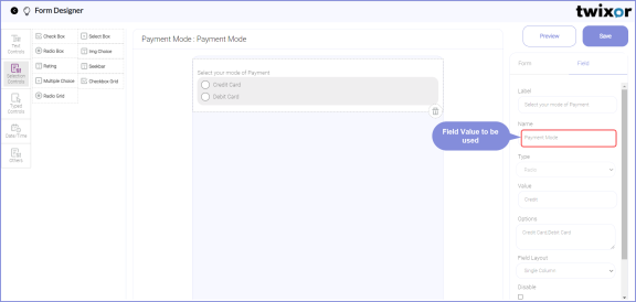
The radio control field name Payment Mode can be reused in other form called Pay through Credit Card.
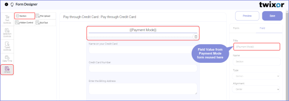
A new section control is added and its label is set as the field value from Payment Mode form.
Output:
When you click credit card option, the corresponding option will be displayed as the label for the Payment through credit card form in the EnCap launch.

After creating the forms, you have to create Buttons for using them in EnCap forms since buttons are required to change the action of the forms when they are clicked.
